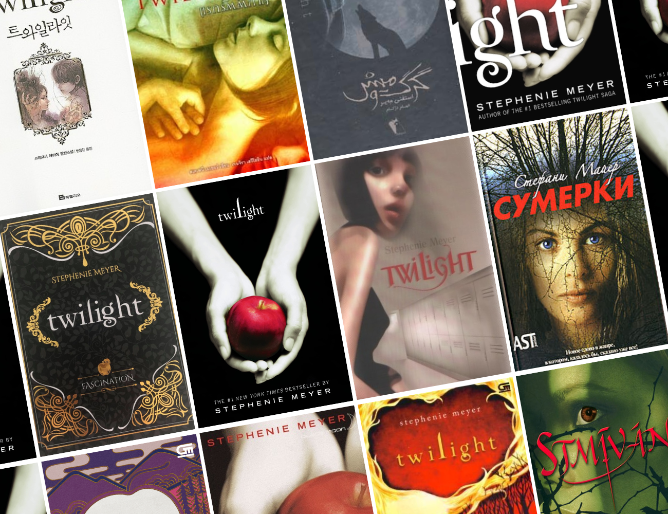
Okay, so we all know the classic Twilight cover. But did you know that each publisher around the world gets to choose their own cover? A lot of them just stick with the original but some countries decide to change it. And, most of them… are not good. So, let’s take a look at some of them!
The Classic:

It’s clear that this cover has almost nothing to do with the actual story. Apples are mentioned a few times in the text but they’re in no way meaningful. However, this cover has become absolutely iconic and I can’t imagine my copies having anything else!
German:
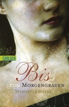
Okay, I get the idea of this one. It’s very much giving Edward’s sparkly skin but it doesn’t feel very ‘Twilight’ to me.
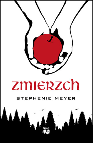
Czech:
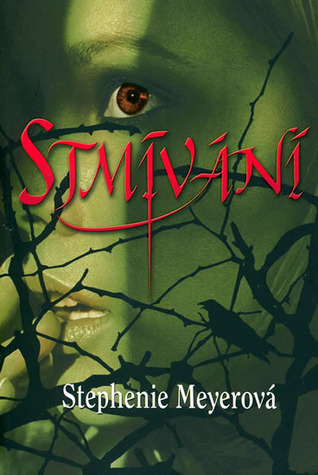
The Czech cover makes me wonder whether the people making it had any idea what the book was about. When I look at this cover I think more of something like Frankenstein or a traditional monster, rather than vampires.
Indonesian:

This Indonesian cover is not completely ugly… but it really doesn’t make me think of Twilight. Who is that on the cover? It can’t be Bella!

This one is also Indonesian and it’s kind of cool but why do we have the apple again?? They clearly take inspiration from the original but it’s also very different to everything else we see!
Russian:
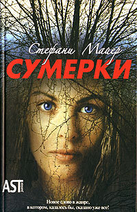
This Russian cover is so weird. It looks more like a poster for a horror movie about witches rather than a teen paranormal romance.
US:

I’ll never forget how much people made fun of these covers when they were announced a few years ago. I’ll just never understand the large font choice.
French:

This French cover is just a worse version of the original. Also, one of the rare times the name of the book is changed!

But I love this edition! It looks like a special edition though I’m not entirely sure if it is. It’s honestly pretty standard for a fantasy special edition cover but you don’t see many of them for Twilight.
Thai:

The Thai cover is…okay? Like, it’s not horrendous but it does not fit the vibes. I’m unsure how I feel about the colour gradient though, I feel like I’m looking at a Taylor Jenkins Reid cover.
Persian:

I’m absolutely obsessed with this Persian cover! Maybe not in a good way because it does make me laugh. I couldn’t find non-movie cover editions for the series but they don’t seem to exist. I do wonder why the wolf was added though since they weren’t really a part of the story until the second book.
However, as much as I am kind of obsessed, it does very much look like a fanmade Wattpad cover.
British:

I’m absolutely obsessed with this cover. Somehow it looks like AI even though it came out so long ago. If this was published now it would be accused of being AI.
It’s so weird and so hard to get. This was a limited print run and they’re almost impossible to find now in the UK. They sometimes appear on eBay but the cheapest I’ve seen is £350.
Korean:
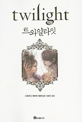
I love this South Korean edition of the book. It’s so simple but just looks so beautiful.
Polish:
Obviously, this is just the original cover reworked but it looks so much worse in my opinion. Although, I do love the inclusion of the trees. I feel like more twilight covers need trees.
Stephenie Meyer’s own designs
And I couldn’t make this post without showing you the covers Stephenie Meyer herself designed when she was handing out early copies to her friends and family!

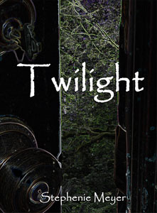
You can say what you want about these but they definitely give ‘Twilight’ vibes more than most of the book covers we actually got!